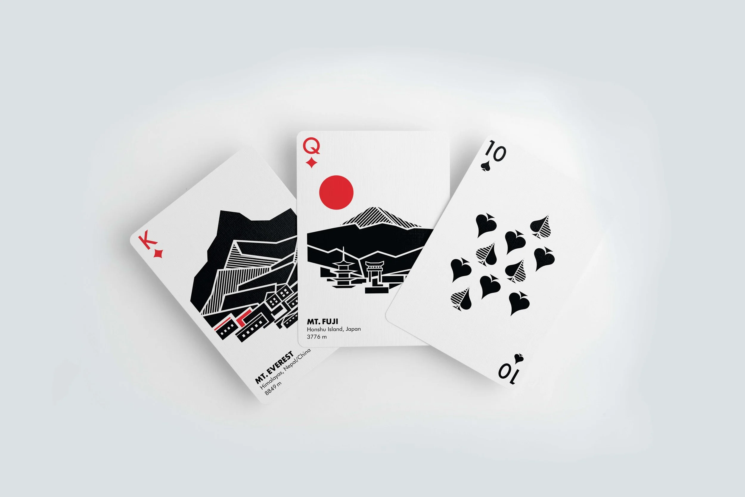
SUMMIT PLAYING CARDS
FALL 2022 / ILLUSTRATION & BRANDING / ADOBE ILLUSTRATOR
A deck of cards that celebrates the highs of life through illustrations of the world’s greatest mountains.
Ideation
I was tasked with creating an original deck of cards composed of 54 cards including four suits, two jokers, and packaging. With this assignment, I needed to develop a graphic concept and a coherent visual language within the fixed framework of the playing cards.
I have a love of the outdoors, hiking, and the environment, so I decided to make a deck of cards that celebrate the highs of life through illustrations of the world’s greatest mountains. To bring this concept to life, I first focused on the face cards which would each depict a different mountain. At the time of this assignment, I was studying abroad in Copenhagen, Denmark, and I felt highly inspired by the minimalist, function-first Scandinavian design that I saw all around me. This influence encouraged me to create a deck of cards that were user-friendly and simple yet effective in portraying a clear concept.
My vision for this assignment was to create a deck of cards that other hiking enthusiasts might collect, so I wanted to include some basic information about each mountain on each card, such as its range, country, and height.
Face Cards — Sketches & Drafts
My first question: how could I create illustrations that made use of a card’s structure? Instead of just placing my finished illustrations in the center, I wanted the card’s structure to inform the illustration process. Inspired by the symmetry seen in many traditional face cards, I wanted to shape each illustration to resemble a reflection.
I started with Mt. Everest. Once I settled on an illustration style, I then began sketching the other mountains. I stuck to black and white illustrations with red accents.
Additionally, I wanted to include aspects of the surrounding environment of each mountain into my illustrations. In my research, I learned that the closest civilization to the base of Mt. Everest are small towns that serve as starting points for hikers.
Suits & Typography
My next question: how could I create suits in the same illustration style and find a typeface that embodied those same characteristics? The answer came easy to me: Futura by Paul Renner. This typeface is known for its nearly perfect geometry and pointed apexes, features that matches my illustration style well. I then created the four suits based off those same features.
Number Cards
With the face cards settled, I then moved on to the number cards. Here I faced another question: how could I use elements from the illustrations to ensure the face cards would create a cohesive deck? My solution: to use the same hatching as on the mountains. I also created a unique grid to place the pips.
Jokers & Packaging
Then I faced my final challenges: what could I illustrate for the jokers and back of the cards? how could I create packaging to convey the overall concept of these playing cards? For the jokers, I decided to illustrate two animals common to the mountain ranges featured on the face cards. For the packaging and back of the cards, I combined elements from several illustrations.


